
As part of my journey as a designer, I thought I’d share with you some of my trend research as it is what I’ve done for a living for the last few years. In these new posts “Well Styled” I’ll be touching on some ideas that I found have been trending… feel free to send me your thoughts!
Color has been THE story of design for a while now. A strong trend that’s been coming on for home design is Pastels… it’s been big at the shows in Europe. While, I do like them right now- they feel fresh and light, I do recognize they might not work for everybody.
However, there are a few ways to do this I find particularly successful, typically it involves a strong pop color detail to create some drama, or grounded with neutrals to keep the pastels from getting too sweet. Otherwise, I think it can end up looking dated or a little too retro in “the bad way”!
To illustrate my point, I’ve pull together a few lovely examples of a softer side to color.

sherbert door colors with beautiful brick

hot pink accents show a little attitude

love the mint with navy in clothing and accessories
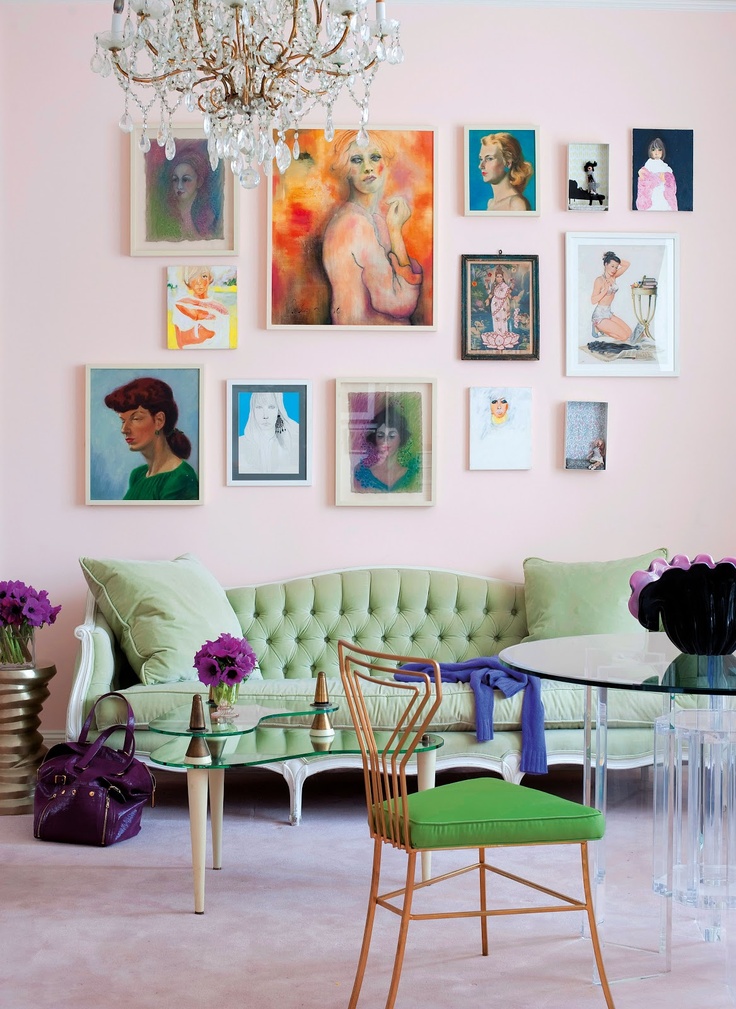
pastel parlor with vibrant pops!

even in florals the bright accent is so fresh
I can see in some of my own choices that I’ve been pinning and picking more in this iced color palette… let me know what you think?


Yay! Love the trending report and pictures. You’re my guru of color!
Friendly suggestion, you may want to note where you found the pics. Keep on rockin’!
Good call! All of my pics are now linked to their home websites… for a short cut, go to my Pinterest account and get them all on my Spring 14 board! http://pinterest.com/wellscituated/spring-14/
Thanks Empress!